 ExitBRIEF
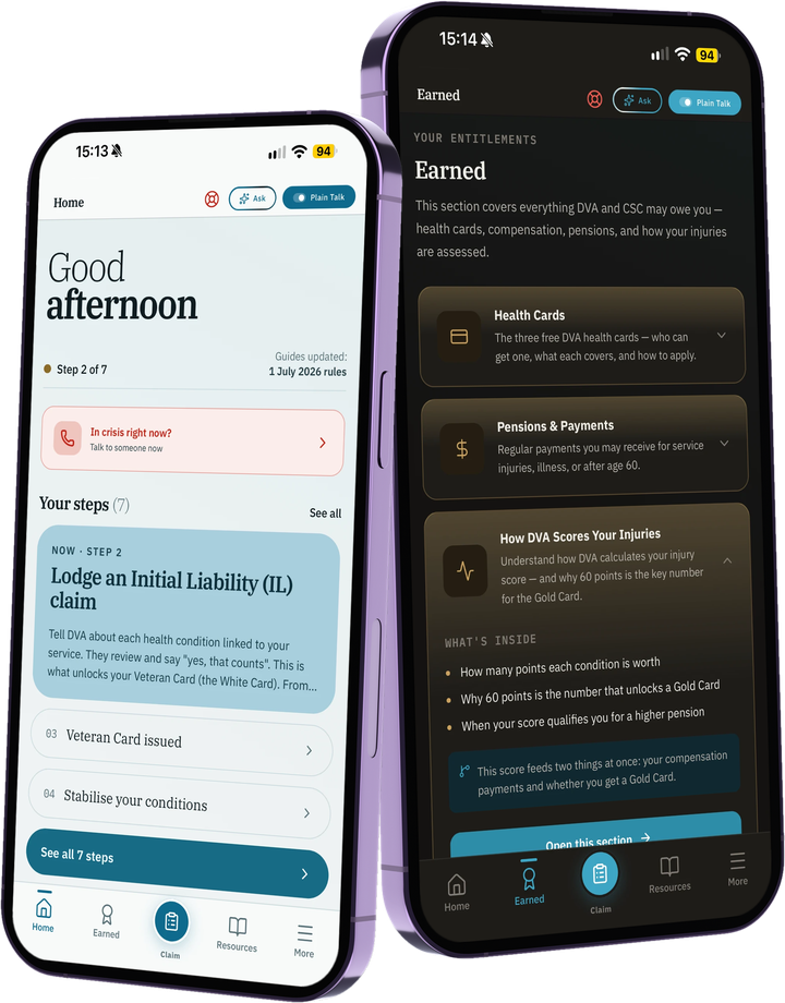
A one-person DVA claim organiser, shipped over four months and rebuilt once.
ExitBrief started as a plain-English guide to the Department of Veterans’ Affairs. It is now a claim organiser: a claim file of conditions, a dated timeline and a list of who you are waiting on, with plain-English next steps checked against DVA’s own pages and a summary you can hand to an advocate. The file is kept on the phone, with no accounts. Designed and built by an Australian veteran.
DVA’s site has everything on it. Almost none of it is readable.
A veteran who needs to know whether they qualify for a Gold Card, find a counselling number tonight, or work out what a TPI claim actually involves has to wade through a bureaucratic portal that assumes they already know the acronyms.
The veterans who most need this information (older, in pain, mid-crisis, or just discharged) drop out before they find what they’re entitled to. The system rewards persistence, which is exactly what the population doesn’t have.
The first version fixed the reading problem. Using it showed a second one: a claim runs for months. You are waiting on a GP letter, a specialist report, a decision, and the paperwork piles up in email threads and shoeboxes. Knowing your entitlements is not the same as being able to run the claim.
Three rules that drove every screen.
- i
Plain English, always.
If a sentence needs a glossary, rewrite the sentence. Year 10 reading level throughout. Not a constraint: the goal.
- ii
Crisis is one tap from anywhere.
A vet in distress doesn’t navigate menus. The Crisis row is the first interactive element on Home, the first row of Quick Finder. One tap to a screen of phone numbers.
- iii
Curated beats clever.
No AI free-text search on the front door. A short triage wizard and a six-tile grid, all hand-written content. Predictability outranks flexibility when the user is anxious, exhausted, or new to the system.
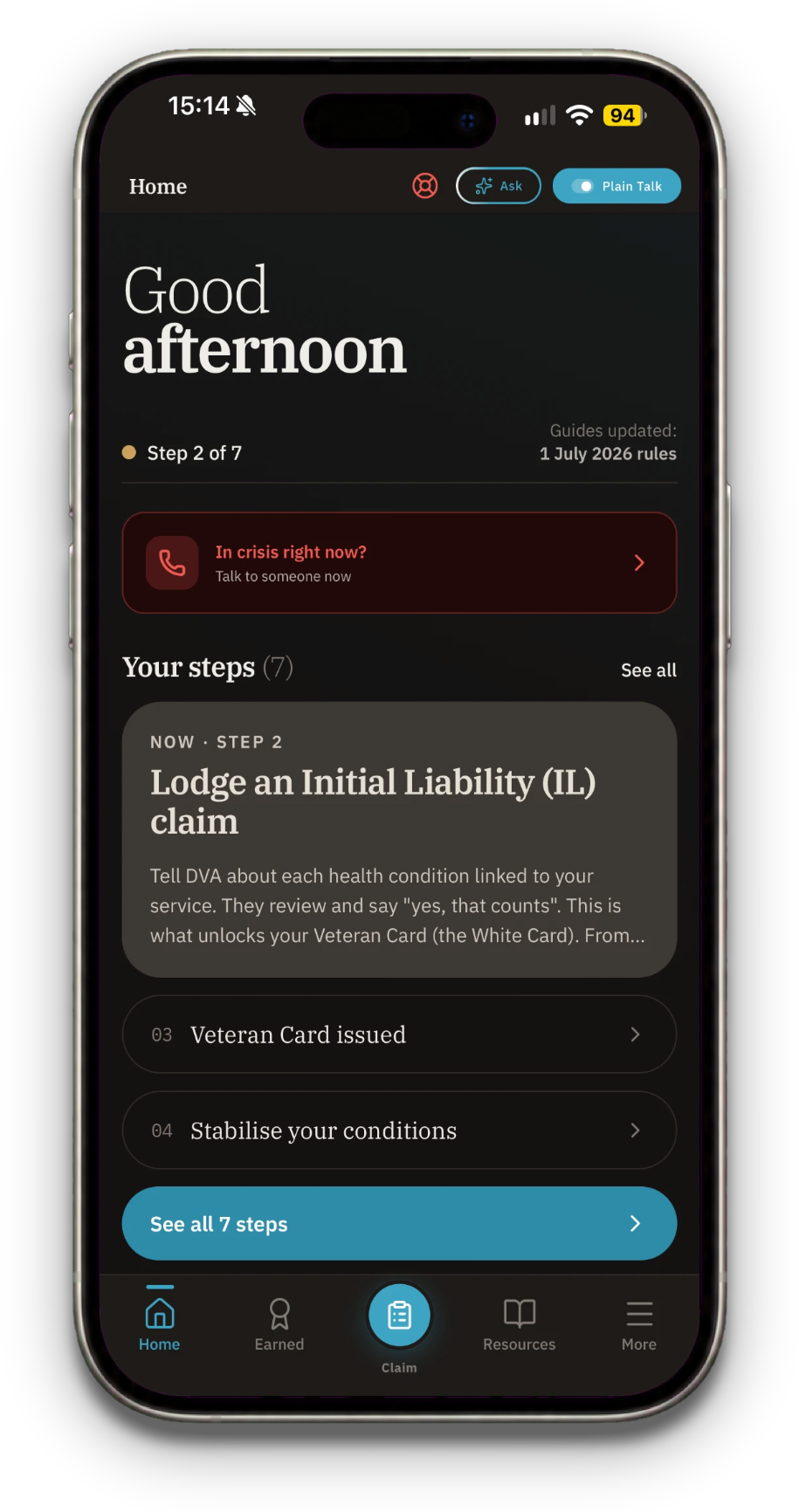
Where you are in your claim, with crisis help at the top
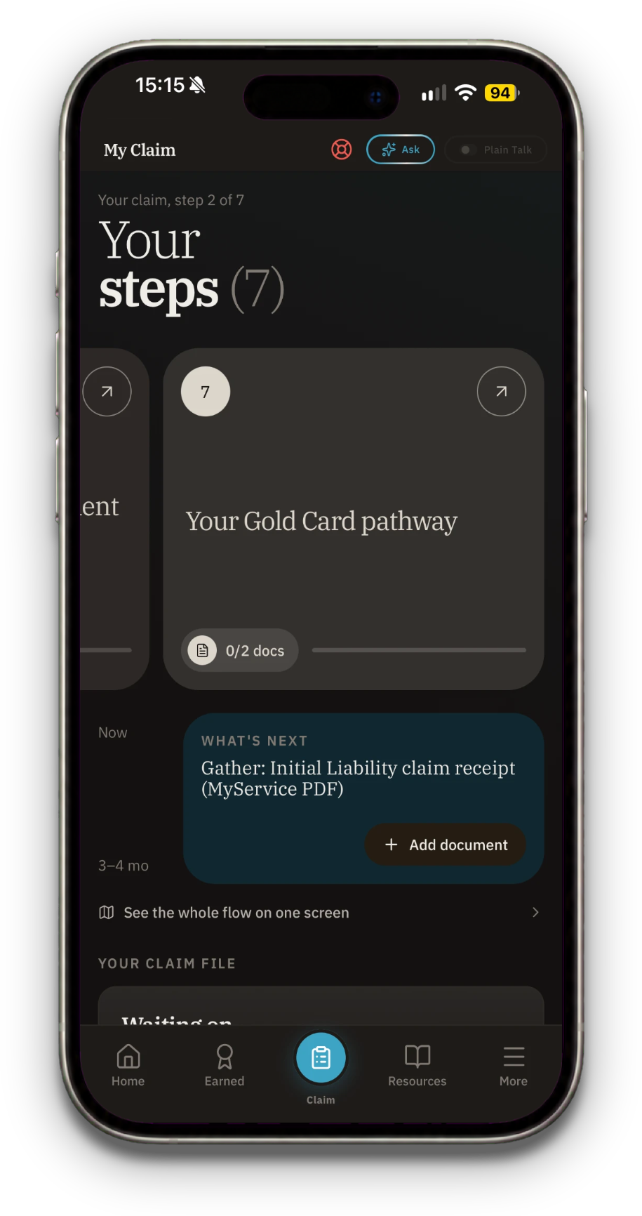
Your seven steps, and what to gather next
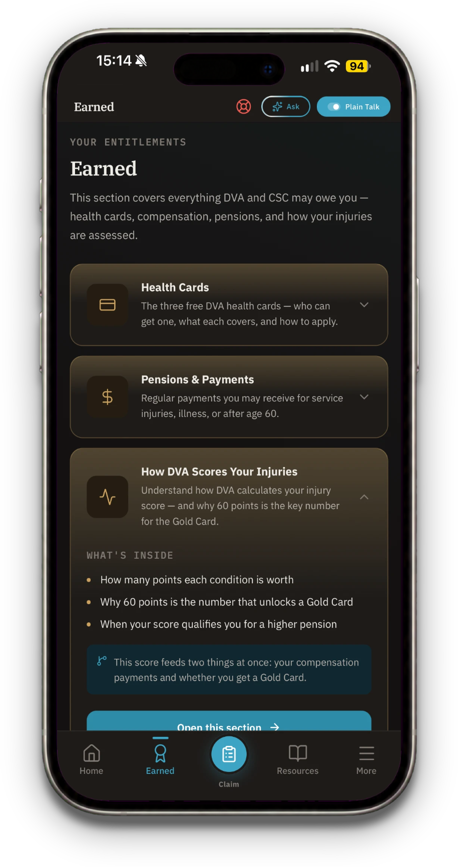
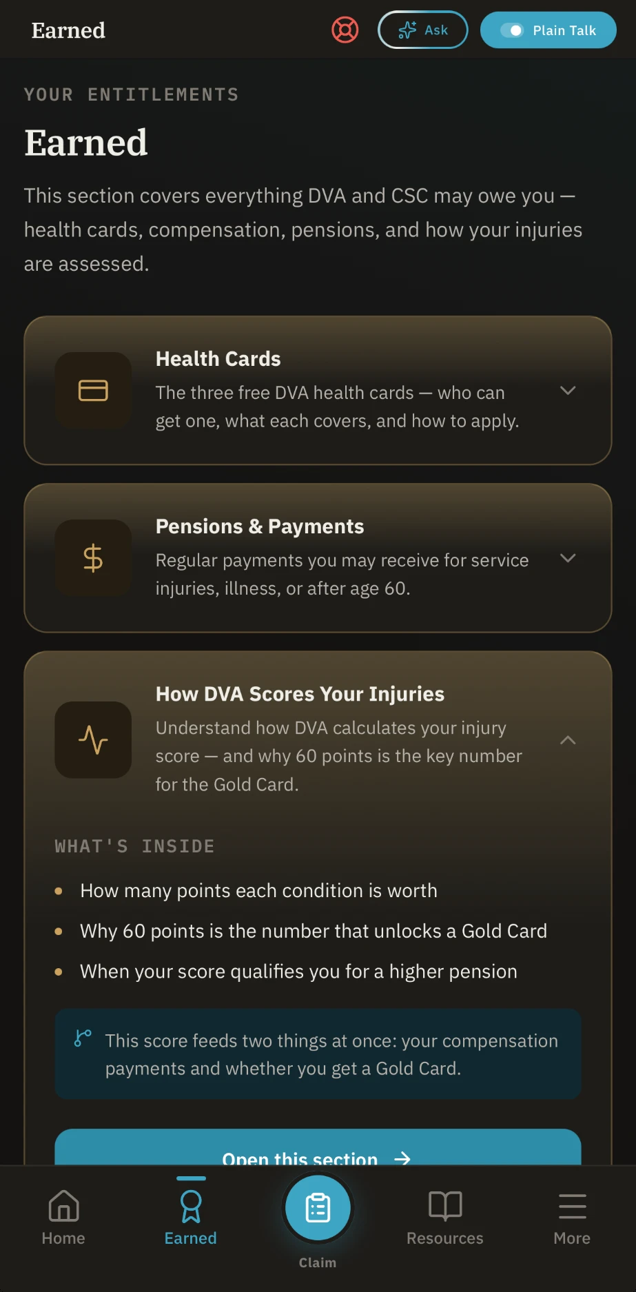
Cards, payments, how DVA scores injuries
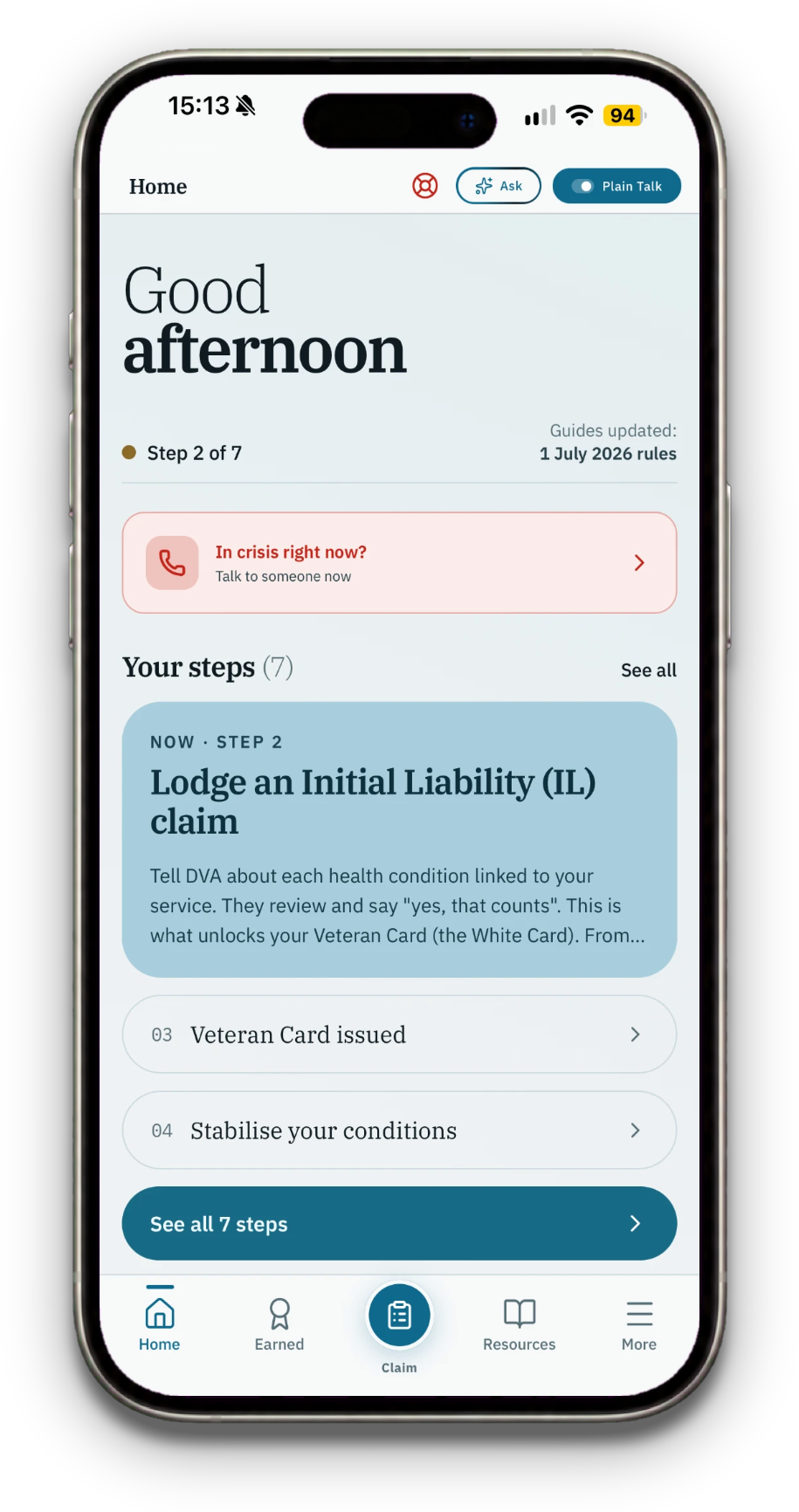
The same screens on ivory paper
The Plain Talk toggle lives in the header. Flick it on and DVA names get rewritten as plain English everywhere the veteran reads. State persists across the app.
Apply
Apply for Your Card
DHOAS monthly subsidy, DHA, DSH loans, and broker guide.
Discounts on your home loan, defence rentals, and finding a broker who gets it.
Submit an Initial Liability claim via MyService, or on paper with form D2051.
Tell DVA about each health condition linked to your service. They review and say “yes, that counts”.
White Card grants access to DVA-funded treatment for accepted conditions.
Once any condition is accepted, DVA issues a Veteran Card. Treatment for that condition is now covered.
Wording is taken from the app. The switch is in the header on every screen.
One type family. Two themes. Red used for one thing only: a crisis.
The system is built around a warm near-black dark surface, with a single teal accent and a translucent dark red reserved for Crisis. The light theme is an ivory paper with no tint, so the blue step cards stand apart from the page. Every other token is restraint.
/Logomark
The mark is two chevrons brought together — the oldest mark of service, rank earned rather than given. Read the other way, they’re two arrows reaching toward each other: one veteran helping another.
- 01Two chevrons. Cohesion over hierarchy. Neither sits on top of the other.
- 02Rank, earned. The chevron is the oldest insignia of service — a shape a veteran already reads as their own.
- 03Two arrows, closing. Help moving inward, from veteran to veteran, not top-down from an institution.
/Wordmark
/Colour palette
Page background · dark mode
Accent · icons · primary actions
Primary text on dark
Pressed · depth · gradients
Hover · focus · highlight
Premium signal · Pro · verified
Elevated callouts · wizards
Tiles · sheets · hub cards
Recessed · rate tables · read-only
18% opacity on Crisis tile
Text on Crisis surfaces
AA contrast verified for every text-on-surface pair. Teal carries action; brass is reserved for premium and verified signals. No pure black (#000) or pure white (#fff) anywhere in the system.
/Typography
Display type is light with a semibold emphasis line, set tight with negative tracking. It gives the app a calm, editorial voice that reads as a record rather than a dashboard.
Body copy, buttons, pills and the tab bar. Same family as the serif, so the whole app is one set of letterforms at different weights.
JetBrains Mono stays wordmark-only. IBM Plex Mono now carries data — stat numbers, phone numbers, verified dates — reading as a service record without borrowing the wordmark's voice.
/Tone of voice
Built for someone having a bad day, not someone at a desk.
No accounts. Ever.
Your claim file and documents live on the device. The only thing that can leave is an Ask AI question, and only if you turn it on. No login flow, no password reset, no ‘we have sent you an email’. Privacy is a product feature, not a settings page.
Static TypeScript data
Concession rates, hotlines, entitlement descriptions live in committed .ts files. No CMS, no API, no stale-cache problems. Trust comes from auditable source and verified dates.
Verified dates per fact
Every dollar amount, every phone number carries a verified: YYYY-MM-DD field. A quarterly audit script flags anything older than 90 days, fails anything older than 180.
Tap-to-call as a first-class action
Hotline rows are styled as primary CTAs, not list items. Tapping opens tel: directly. The phone is the path of least resistance, not a fallback.
Plain Talk, off until you ask
A global simplify switch in the header, off by default. For the first three days Home carries a one-line hint pointing at it, then it goes away for good.
One idea per screen
Home shows where you are and the next step. My Claim shows your seven steps, then the claim file underneath. Nothing competes for attention in the middle of a bad day.
Follow-ups without pressure
The waiting-on list counts days since you asked, and one tap shares a polite message to the person you are waiting on. It never claims, threatens or promises an outcome.
Checked against WCAG AA, with the gaps written down.
Body text is 15.6:1 on the light page and 16.0:1 on dark. Step cards run 6.7 to 9.5:1. Crisis red is 5.2:1 on light and 5.6:1 on dark. In an October audit, muted text on the dark theme came in at 4.4:1, just under AA, and was lifted to pass.
The October audit found the waiting-on buttons at 36px. They are now 44px, and the small remove icons carry extra tap area around them.
Body text follows the system text size. Display titles and the tab labels are capped (1.15x and 1.2x) so layouts hold. Testing at the largest sizes on a real iPhone is still to do.
The Ask pill’s shimmer and the onboarding intro both consult the reduce-motion setting. With it on, the intro shows its final state and nothing moves.
Interactive elements carry a role and a spoken label, including the claim-file actions, for example ‘Send a follow-up about GP letter’. The crisis tile announces ‘In crisis right now, open crisis support’.
Three screens doing the heavy lifting.
Emergency, Lifeline, Open Arms and more, each one tap from dialling. Open Arms is the large card at the top, the rest are quiet tiles, and Emergency stays red. This screen exists so a veteran in distress never has to navigate.

Your steps, and what is next.
Seven plain-English steps as cards you swipe through, with what to gather next. Under them sits your claim file: waiting on, conditions and a dated timeline, kept on your phone.
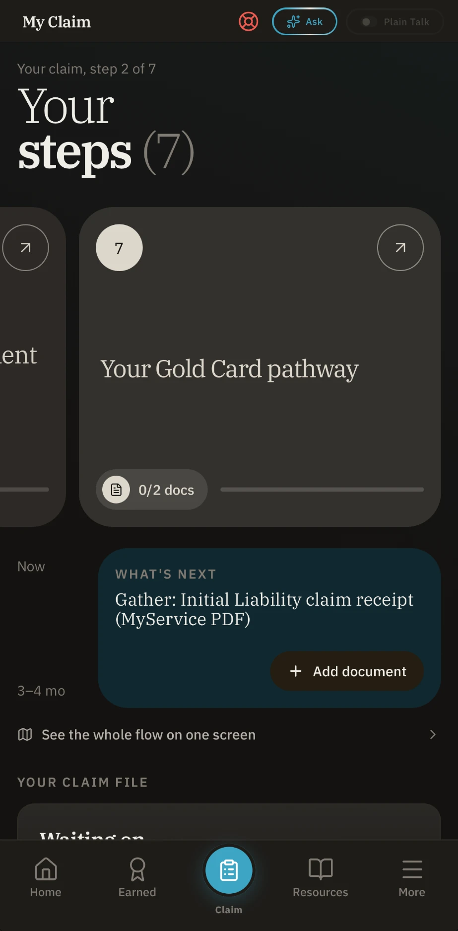
What it all means.
Health cards, pensions and payments, and how DVA scores injuries, explained plainly. Cards open to show what is inside.
The product, today.
Counted, not claimed.
It is live and free on the App Store. There are no usage metrics worth pointing at yet, so what follows are countable facts about the product itself: what it ships with, not what it’s done for anyone.
No signup, no password, no email verification. Open the app and use it. Your claim file lives on the device.
Emergency 000, Lifeline, Open Arms, Suicide Call Back, 1800RESPECT. All dialler-ready on the Crisis screen.
Every screen, every guide, the claim file and every crisis line are free today. No ads and no trial.
A plain-English walk-through from service records to the Gold Card pathway, each step dated against dva.gov.au, with documents stored on the device.
What I’d revisit, what I’d make again.
The Apply tab’s floating 0/7 badge
It floated top-right of the Apply hub, landing on the page heading and repeating the same X/7 the card directly below it already stated. A stat worth surfacing, in the one place it wasn’t needed. It now appears only on the journey and flow views, where that card isn’t on screen.
Static TypeScript data over a CMS
Every content update is a code commit. Slow if I were optimising for content velocity. But every fact has a git blame, a verified date, and a peer-reviewable diff. For a product where a wrong figure could cost a vulnerable user real money, auditability outranks ease.
The floating Ask button
The Ask button floated bottom-right with a diagonal shimmer on a six-second loop. It was meant to signal ‘the smart thing’ but read as the designer’s favourite. In October it was removed and became an outlined pill in the header next to Plain Talk, with a quiet ring shimmer that stops under reduce-motion.
A solo project. Made for the people who knew the system from the inside and got tired of pretending it was findable.
Download on the App Store